top of page


"Figure It Out" App
Team: Seth Baldwin
Time Frame: 2 weeks
Tools: Figma, Miro, Adobe Illustrator
The problem: Artists and other creative people lack access to live models or quality reference photos when drawing the figure. Most available model photos are very standard and lack diverse body types and poses, but live figure drawing classes are expensive and time consuming.
The solution: A figure drawing simulation in the form of a mobile app. Figure it Out provides the tools to experience a figure drawing class without leaving home. The app features 360° interactive model photos, master figure drawing classes, and a reference art history library.
Research
In order to understand what artists would expect from a figure drawing simulation we needed to interview potential users. We chose our interviewees very carefully since we needed people from different backgrounds that specifically drew the figure on a regular basis, not just people who liked to draw. We also wanted people from different backgrounds since not all users would be professional artists. We asked five people a series of questions to get insights on their: drawing habits, figure drawing class experiences, art history knowledge, reference photo sources, and expectations for an online figure drawing simulation. We then collected all the data and organized it in an affinity diagram in order see which answers repeated.
Users Wanted:
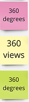
•360° views of models
•Dynamic and non-traditional poses
•Diverse models with non-traditional or more natural body types
•Instructors who can break down proportions and measurements
•Interactive classes and feedback from teachers
•A place to save and view all their reference photos
•High quality reference photos
•A tutorial video archive
•To learn from art history and reference techniques


With this information we were able to determine which features were the highest priority. It took several rounds of narrowing down before we were able to decide on the final list


Define
We then defined a user persona based on our interviews in order to understand how the average user would interact with the app

We created a user journey map in order to better empathize with our end users' experience

Ideation
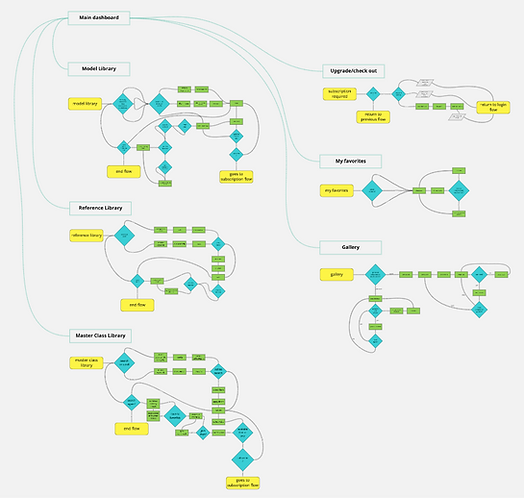
After getting a better understanding of our user’s pain points and goals we were able to determine the paths they would take while navigating the app. We used these flows as the basic structure of Figure It Out.

We started sketching out key flows using other photo platforms such as Pinterest and Instagram as inspiration since our users also used these sites.

Prototype
We then created low-fidelity wireframes of all the screens to start getting a better understanding of our layout.

However, we were struggling to include the “interactive class” feeling that users were looking for. We explored incorporating live zoom classes or live chats with the other instructors. The live options didn’t seem reasonable since users have busy schedules and having live insructors would be a costly option. Instead we settled on a social media aspect of the app where the user could post pictures or their work, see their peer’s work, and get feedback via commenting. We also included a comment section on the videos so users could have a chance to ask questions and engage with the Figure It Out community.

Testing
We guerilla user tested our low-fidelity prototypes. We wanted to test early in order to find out where users got stuck in order to work out the main issues before getting too detailed. Users gave lots of very positive feedback after testing the app. People who weren’t artists and didn’t know the industry jargon still thought the app was intuitive and easy to navigate. This means beginners downloading the app to learn from scratch would still be able to get started easily. Overall, the app got positive feedback, but our users still had a few hangups and suggestions:
•The button “Reference Library” confused users since the model images were also refered to as reference photos
•Preferred hearts for liked images rather than stars
•Didn’t like the hamburger menu
•Didn’t like “Premium” in the nav bar
•Wanted to see the home button on the left side of the nav bar
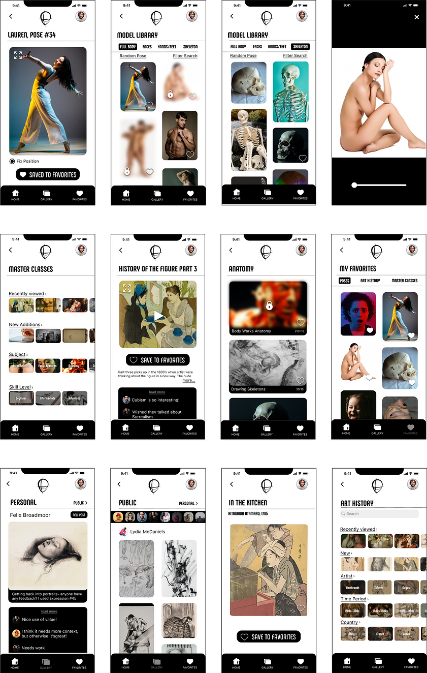
We made some adjustments to the layout in order to help users navigate more easily. We changed the homepage to only have reference photo and video libraries and we changed“Reference Library” and renamed it “Art History.” Instead of the hamburger we created a “Profile” drop down menu attached to a profile picture which holds subscription and settings information.

In order to show users all the features of the app we created a detailed onboarding flow with coaching screens. This would eliminate user errors and the need for intrusive pop-ups when the user opened the app.

Final Product
With the skeleton of the app fleshed out we brought in the rest of the images and a refined design scheme. I designed the logo based on a loose sketch of a head- the typical starting point when drawing the figure. The color scheme of simple black and white was intended to keep the app looking clean since it featured so many different reference photos. It adds a classic touch while not taking away from the images. The header typeface “Phenomena” adds some style since the overall color scheme is simple. The curved letters also mirror the lines in the human body. We paired that with “SF Pro” to stay on brand with Human Interface guidelines. The san-serif body text is easy to read and the slightly narrow letter width compliments “Phenomena.”

bottom of page