top of page


Rotten Tomatoes
Tools: Figma, Miro, Adobe Illustrator, Procreate
Time Frame: 3 weeks
Team: Seth Baldwin
Responsive Redesign
The problem: Rotten Tomatoes is a cluttered and overwhelming site. Users are spending too long searching for reviews and are not familiar with some of the language on the site, which is causing them to go to other, better organized, review sites.
The solution: An updated Rotten Tomatoes website with a more modern UI, more accessible copy, and simplified path to reviews. User experience is improved by decreasing the amount of time spent searching for a review.
Research
In order to truly improve the usability of Rotten Tomatoes, we had to find out user habits expectations. We started with a competitor analysis and looked at the design and navigation of other popular review sites: IMDB and MetaCritic. Then to find out more about the people interacting with these sites we sent out a survey asking 30 potential users about their review experiences.
Do you read movie/
TV reviews?

Do you trust critics
over peer reviews?

Are you familiar with
the "tomatometer"?

We also interviewed five more avid movie and TV watchers to find out more in depth information. The goal of our interviews was to answer these questions: Why does the user read movie/tv reviews? Does the user prefer critics or peers? How long does a user typically spend reading a review? What makes a dependable review? What pain points does the user have when searching for a review? Do users understand the "Tomatometer"? We organized the interview and survey results in an affinity diagram to see if there were any repeat answers.


Users Wanted:
•Scannable information
•Quick facts ("Tomatometer"/audience score, synopsis, genre, rating, director, etc...)
•Access to both critic and peer reviews
•Explanation for the "Tomatometer", specifically the "Fresh Pick" icon
•To easily find a specific movie TV show
Based on the interviews we had a very clear idea for key features in our updated site. We used a feature prioritization matrix to make sure all designs were in the scope of our project.


Define
We created a user persona to tell the story of a typical user


Ideation
Keeping the users' goals in mind, we created a flow for finding a review. We needed to keep the flow simple because we wanted to shorten the time the user spent locating a specific review.

The original Rotten Tomatoes site had an overwhelming menu, so we needed to find a new, more simple solution. After several rounds of card sorting we decided on this sitemap:

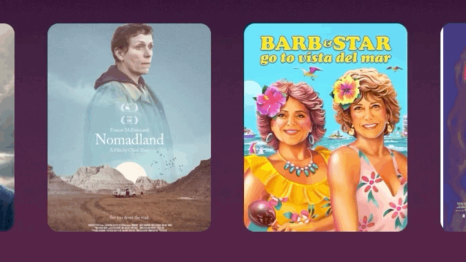
After we reorganized the flow and navigation for the site, we started sketching screens. We based the overall layout on popular streaming platforms like Netflix and Hulu. Our users spent a lot of time streaming and frequently browsed Rotten Tomatoes while using those sites.


Prototyping
Based on the sketches we created low fidelity wireframes for our first prototype.

DESKTOP LOW FIDELITY WIREFRAMES

MOBILE LOW FIDELITY WIREFRAMES
Testing
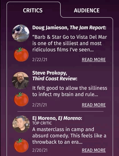
First, we user tested our low-fidelity wireframes to make sure that our layout was easy to understand before we started adding too many details. We focused on having users test the following flows: 1. Find a review for the movie "Barb and Star go to Vista Del Mar" 2. Find a review for the TV show "Your Honor" and 3. Find out what the "Tomatometer" means. We had several paths the user could take to complete each task to account for different peoples' browsing habits.
Lo-fi prototype testing feedback:
•Shrink images in swim lanes for easier scanning
•Differentiate "Top Critics" from other reviewers
•Overwhelmed by text on the "Tomatometer" page and needed more bolded phrases
•Struggled with the "Tomatometer" diagrams


Every time we changed the prototype based on user feedback, we would do another round of guerilla user testing. We were continually testing ensure we were creating a product that was user friendly.
Med-fi prototype testing feedback:
•Most users gravitated to the search bar to find a review
•Users didn't know to scroll down- hero section needed to be smaller to hint that there was more on each page
•Cast and reviews needed to be swapped since people were looking for reviews
•Limited hierarchy in the navigation- needed to push font weight and size


Since so many users went straight to the search bar when looking for a review we decided to prototype that flow. We had a search drop down suggesting movies based on letters the user had typed. In the drop down there are quick facts about each movie. This way the user can get the score, MMPA rating, genre, and run time without even having to click on the movie.

We also conducted several rounds of A/B testing so that we could refine specific color and spacing details. We wanted to make sure we were designing for the user and not just our own aesthetic choices.


Final Product
Our final design scheme was influenced by dark movie theaters and red velvet seats. The "dark mode" color scheme mimicked being in a theater and highlighted the icons. We chose the typeface "Fira Sans" for its legibility, simplicity, and wide variety of weights. We wanted to keep the typography on the site very simple since there were going to be so many movie/TV posters and images on the site. We redesigned the logo as well to match our more modern aesthetic.


I also redesigned icons on the site. The "Rotten" confused users since it was bright green, a color generally associated with positivity and success. The"Certified Fresh Pick" icon needed to be simplified because was illegible at such a small size.

CERTIFIED FRESH
FRESH
ROTTEN
Since our site had a relatively simple flow, we wanted to emphasize the micro-interactions on the page. The micro-interactions helped increase visual interest while also alerting users to loading information and clickable buttons. We also had the movie/TV show cards expand so that users could get quick information without having to go to a new page.


bottom of page