top of page


Tools: Figma, Miro, Adobe Illustrator
Time Frame: 2 weeks
Team: Seth Baldwin & Kenzie Taff
NARF Responsive Redesign
The problem: The Native American Rights Fund (NARF), a non-profit located in Boulder, CO, relies on donations in order to provide legal aid to tribes all over the nation. However, website, a key platform for gathering these donations, is busy, out-dated, and overwhelms users with disorganized information.
The solution: An updated website with a new sitemap, streamlined checkout flows, and a modern design scheme. Users can more easily donate while being able to read about key information. The responsive redesign also allows for users to seamlessly view the site from desktop, tablet, and mobile platforms.
Research
In order to better understand the donor behavior as well as identify the pain points of NARF, we reached out directly to the nonprofit stakeholders to gain insight. We asked about typical donors, where the donation money goes, and if they had received many inquiries about COVID-19.
Key Stakeholder Insights:
•Donors are individuals, foundations, and some tribes
•Donor demographics are similar to other non-profit organizations and they receive donations in all amounts
•Donations into the Native American community is estimated at only 0.35% of all philanthropy happening in the United States
•NARF engages in approximately 55 cases/programs at a time, but about 35% their work focuses on environmental protection
•They have seen an increase in inquiries about COVID-19, but they send those interested to other organizations and tribes that handle projects
We also interviewed 5 users and surveyed 10 people who had experience donation online. We wanted to gain a better understanding of the important factors that contribute to a user successfully completing a donation.


Users wanted:
•Most users want to know about the history of the organization and where the donation money ends up going
•Users want to know if it is a reputable site and know that the donation process is secure
•They want to donate quickly and seamlessly
•Some subscribe to monthly newsletters or recurring donations
•Users had never heard of the Native American Rights Fund
•They knew about some of the issues facing the Native American communities, but only the general idea
We also conducted competitor analysis to see how other organizations handled the donation flows and overall site organization. Our direct competitors were Native Wellness and American Indian College Fund while the indirect competitors were Planned Parenthood and the NAACP. We were especially inspired by the American Indian College Fund's donation breakdown graph and the NAACP's quick donation amount guide.


Define
We created a user persona based on the data gather from interviews and surveys. Hank represents users coming to the site to donate and find more information about NARF.

Ideation
Keeping the Hanks goals in mind, we created thee different user flows: one for finding out more information about the organization, one for donating, and one for staying engaged and up to date with the non-profit.


Then we reorganized the sitemap according to the flows. Our new sitemap created a much more streamlined site with less wordy navigation options.

Prototyping
After determining the overall flow and navigation of the site, we were able to start designing preliminary low-fidelity wireframes. Based on Hank's goals we needed to include a simple donation checkout that was accessible from multiple areas, an infographic explaining where donations go, and an easier way to learn about the organization's key issues. We also needed to include a homepage section about e"Environmental Protection" since it is a huge focus for NARF.
DESKTOP LOW FIDELITY WIREFRAMES


MOBILE LOW FIDELITY WIREFRAMES


Testing
Then, we tested our low-fidelity prototypes to ensure it was easy to navigate. We received the most feedback on the "What We Do" page. Based on the feedback we ended up scrapping that page and rethinking the design. The solution was a simple secondary menu where users could easily switch between the issues.


Feedback:
•The individual issues on "What We Do" are too large and don't allow for easy scanning
•Body text and footer text on mobile are too small
•The donation box on mobile should go farther down the page since it's too "in your face" as the first thing that a user sees when visiting the site
•The "What We Do" button don't read as buttons- make them clear CTAs


Final Product
The final UI design direction meant to reference the traditional earth tones, but maintain a simple and modern feel. We wanted users to feel at ease and engaged with the content. We included the serif typeface "Frank Ruhl Libre" for the headers as a reference to more traditional design and NARF's original site branding. For legibility we used the sans serif typeface "Ubuntu" for body text and smaller headers. All images were were of native landscapes since environmental issues are a huge part of the non-profit's work. However, we would have liked to include more pictures of the indigenous people directly impacted by NARF. Unfortunately we didn't have access to those images at the time of this project. I also redesigned the logo for a more modern and simple look to compliment the site design.


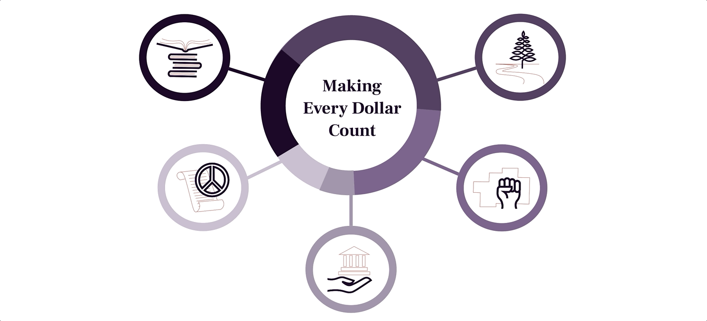
I also created an interactive infographic with original icons to let users know where their money was going. On hover a brief description opens about current NARF cases and issues. The colors and slices of the circle represent the percentage of funds that are dedicated towards each cause. *this is just a sample for design purposes- the percentages and issues do not reflect actual NARF data
We reached out to NARF after completing this project. While they do not have the time or resources to completely redesign their website right now, they loved our final product and wanted to use it as insipration as they make updates in the future. See the final prototypes here:


bottom of page